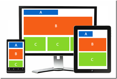
Adaptive UI (USER INTERFACE) - Taking Over Responsive.
“This adaptive UI (USER INTERFACE) guidance includes a flexible grid that ensures consistency across layouts, breakpoint details about how content reflows on different screens, and a description of how an app can scale from small to extra-large screens.”
Why Use Adaptive UI (USER INTERFACE)?
Adaptive UI (USER INTERFACE) is useful for retrofitting an existing site in order to make it more mobile-friendly. This allows you to take control of the design and develop for specific multiple viewports. The number of viewports that can be selected to design for is entirely up to you, your company and overall budget. It does, however, afford you with a certain amount of control that you won’t necessarily have using responsive design.
Adaptive Design deals with the progressive improvement in the quality of a website and in that regard it holds the pieces of Responsive Design that went beyond the grid. The key difference here is that many of the initial forms of Adaptive Design deal with server requests as opposed to relying on media queries within CSS or HTML. At its simplest, this means re-directing users to a mobile site.
It's worth noting that as Responsive Design evolved to focus on device-agnostic grids, writing media queries to focus on the width of the viewport instead of the device, Adaptive Design remained focused on providing content based on the device type or device width. Generally, you would begin by designing for a low-resolution viewport and work the way up to ensure that the design doesn’t become constrained by the content.
It’s standard to design for six resolutions. However, you can make a more informed decision by looking at your web analytics for the most commonly used devices and then designing for those viewports.
If you want to design an adaptive site from scratch, that’s okay too. Start again by designing for the lowest resolution and work your way up. You can use media queries to elaborate the layout for higher resolution viewports. However, if you do design for multiple resolutions, you may find that this causes the layout to ‘jump’ when resizing a window.
The results in load time speak for themselves:
Weighing the Benefits of AWD (Adaptive Web Design):
Users of adaptive design cite a handful of distinct benefits for using this type of design outline. (And their arguments make a lot of sense.)
1. Better performance: The way the website is served, it renders faster and more efficiently for users.
2. Flexibility increased: You can make changes where they are needed in the code without impacting the entire site. So if a button doesn’t work for iOS users, then an adjustment can be made without potentially breaking something that does work for an Android user.
3. It makes you think about content strategy: Because your website is actually designed specifically for different devices, you can design functionality in great detail. How do you want something to work? How do you want users to engage with your website? You can make it happen in a way that is unique to the user and device with an almost personalized experience.
An adaptive design will ensure the best user experience according to whichever device the user is using to interface. Unlike responsive design, where a screen “flows” from desktop design into a smaller device’s, the mobile-device by making our design touch friendly. Meanwhile, it can be done the same for desktop users. We begin at the lowest resolution version of the site and work our way up to the highest.
jaydave94@gmail.com


Comments
Post a Comment